Scrape.do
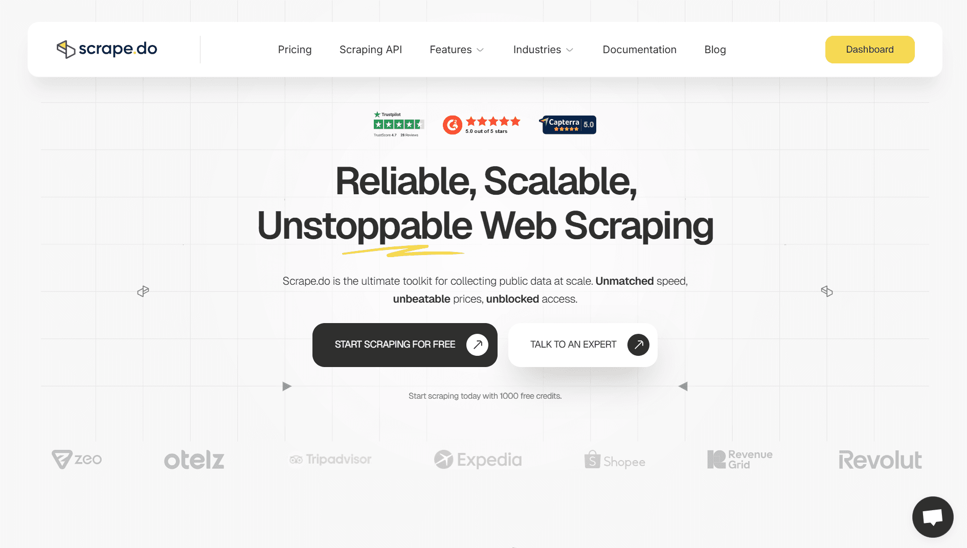
We rebuilt the Scrape.do story for a technical audience, turning product logic, performance claims, and developer-facing detail into a website that feels credible at first glance.
Goal
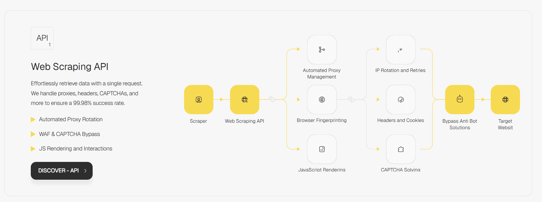
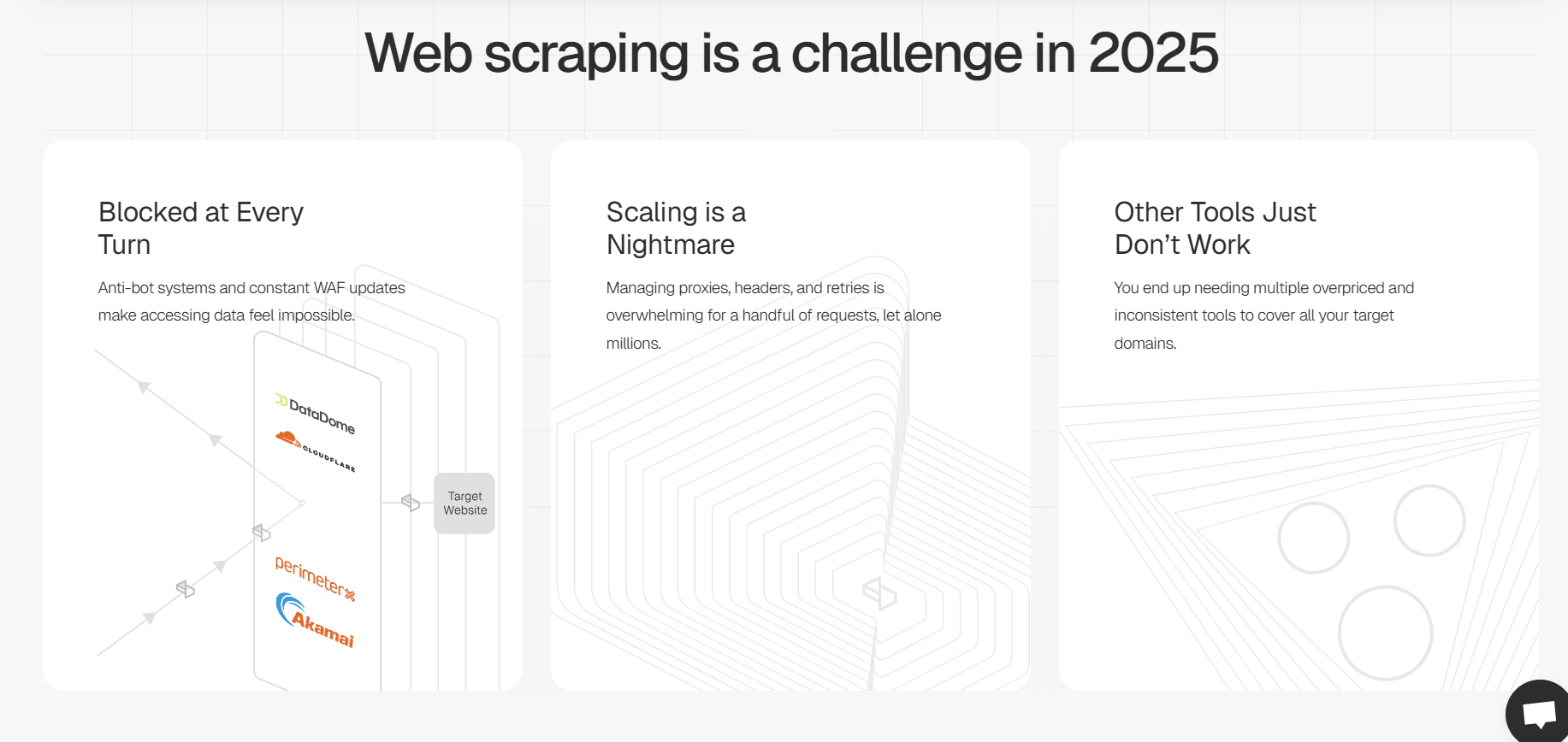
Scrape.do speaks to developers, so the work had to explain both the product and the methods that make it different. We used diagrams and data-led storytelling to show how the platform reaches a 99.99% success rate.
Approach
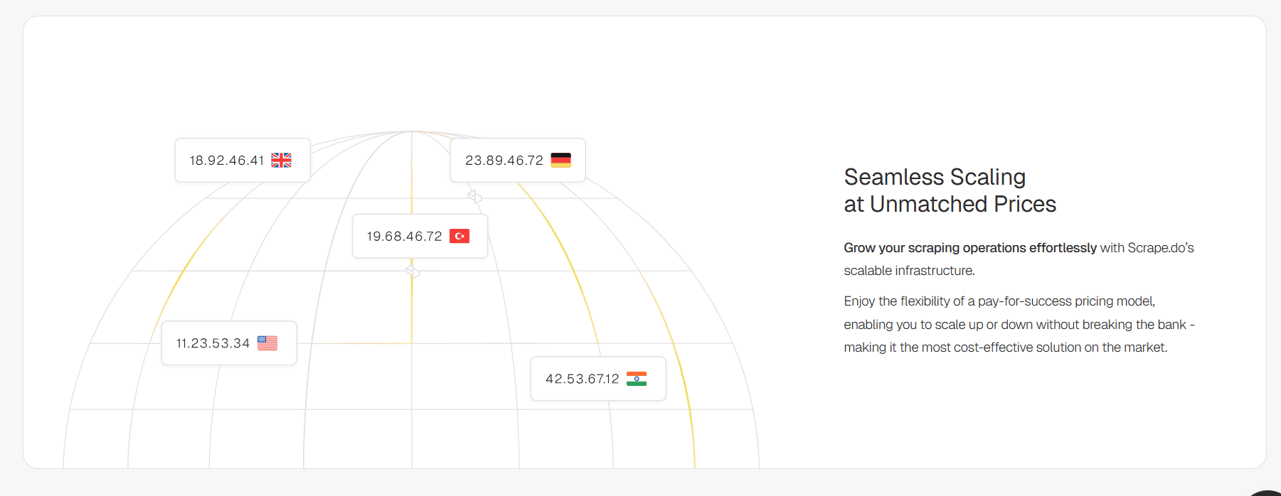
We turned the triangular, striped structure in the Scrape.do logo into a core brand device. A grey, yellow, and purple palette brought the identity closer to the software world, while animated system visuals helped make the technical story easier to grasp.
Result
The final site translated technical depth into a clearer, more distinctive brand experience without losing the product's engineering credibility.